

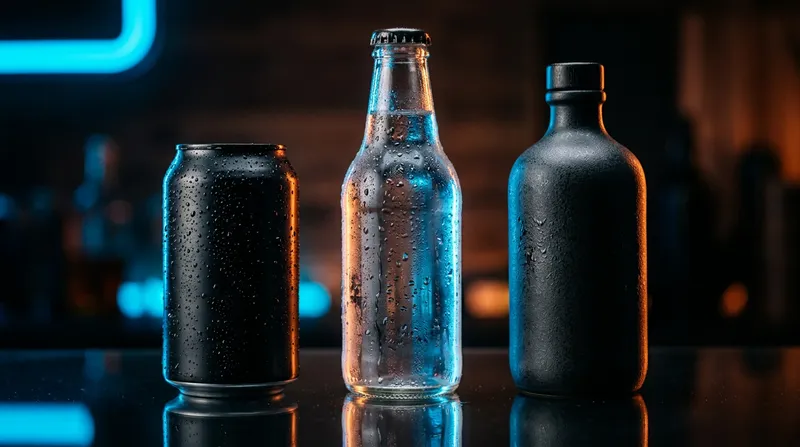
A refrigerator door is an unlikely place to study cultural change. Yet the lineup inside it can reveal a great deal about what people value: convenience, visual identity, ingredients, nostalgia, and the pleasure of participating in a shared ritual.
A drink is rarely just liquid. It is a container someone holds, a label someone recognizes across a room, and an object that helps define an occasion. The evolution from anonymous glass bottles to vividly differentiated cans is as much a story about design and behavior as it is about taste.
The container became the message
Early mass-market beverage brands learned that packaging must perform two jobs at once: protect the contents and remain identifiable at a glance. Color, type, shape, and even the sound of opening a container gradually became parts of a brand identity.
A long-neck glass bottle suggests a different setting from a slim aluminum can. An amber bottle can imply tradition, while a sparse white label may evoke precision or restraint. These signals work long before someone reads an ingredient list. None of them, however, establishes the quality of what is inside.
Why small rituals survive big changes
Consider the moment before someone pours a drink for a guest. There is a question about ice, the choice of glass, perhaps a citrus slice or a coaster. Those small actions make an ordinary exchange feel like hospitality.
Modern beverage categories have borrowed the same vocabulary. Sparkling waters, botanical sodas, alcohol-free aperitifs, and functional drinks offer different ways to participate in a familiar social moment. Their success as cultural objects cannot be understood by flavor alone; they also fit an existing script.
An ingredient list is a second design layer
On one side of a package sits the emotional promise: crisp, lively, subtle, or celebratory. On the other side is the practical document: what is in this drink, how much is in it, and which warnings or storage conditions apply.
For conventional drinks, caffeine, sugar, sweeteners, and allergens can change the suitability of a product for a particular person. With infused beverages, cannabinoid information adds an important additional layer. A cannabis-containing drink can be intoxicating even when its packaging resembles a familiar soda. Total THC per package, serving information, and applicable age restrictions matter more than an attractive flavor description.
The rise of categories that do not look alike
It is tempting to call every alternative beverage part of one trend, but the products can have unrelated purposes. A zero-proof cocktail recreates an adult flavor ritual without alcohol. A botanical sparkling water focuses on aroma. A cannabinoid-infused drink raises separate questions about impairment and regulation. The variety is visible when browsing a retailer’s https://thekannacollective.com/product-category/beverage/ Yet a category page should be treated as a starting point for reading individual labels, not as evidence that everything in the category behaves the same way. Ingredients, cannabinoid amounts, and the rules governing sale can differ substantially.
A beautiful can is still a product with a job
Packaging works best when its visual cues align with clear, useful information. A well-designed can should make a product recognizable, but it should not hide important details in microscopic print or rely on ambiguous promises.
The most interesting beverage innovation may not be a new flavor at all. It may be the expectation that a drink can express identity, support a ritual, and still communicate exactly what is inside. The brands that manage all three ask the design to do something harder than simply look good.

